Gradients are the quiet workhorse of modern design. A flat colour is fine; a well-judged gradient adds depth, movement, and a sense of light without adding a single extra element. The trouble is that gradients are also easy to get wrong: a clash of hues or too much contrast behind text and the whole thing reads as amateur. This guide covers the small number of rules that make gradients work, and where they earn their place.
The three gradients you'll actually use
Most of design comes down to three gradient shapes. Knowing which one a situation calls for is half the battle.
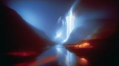
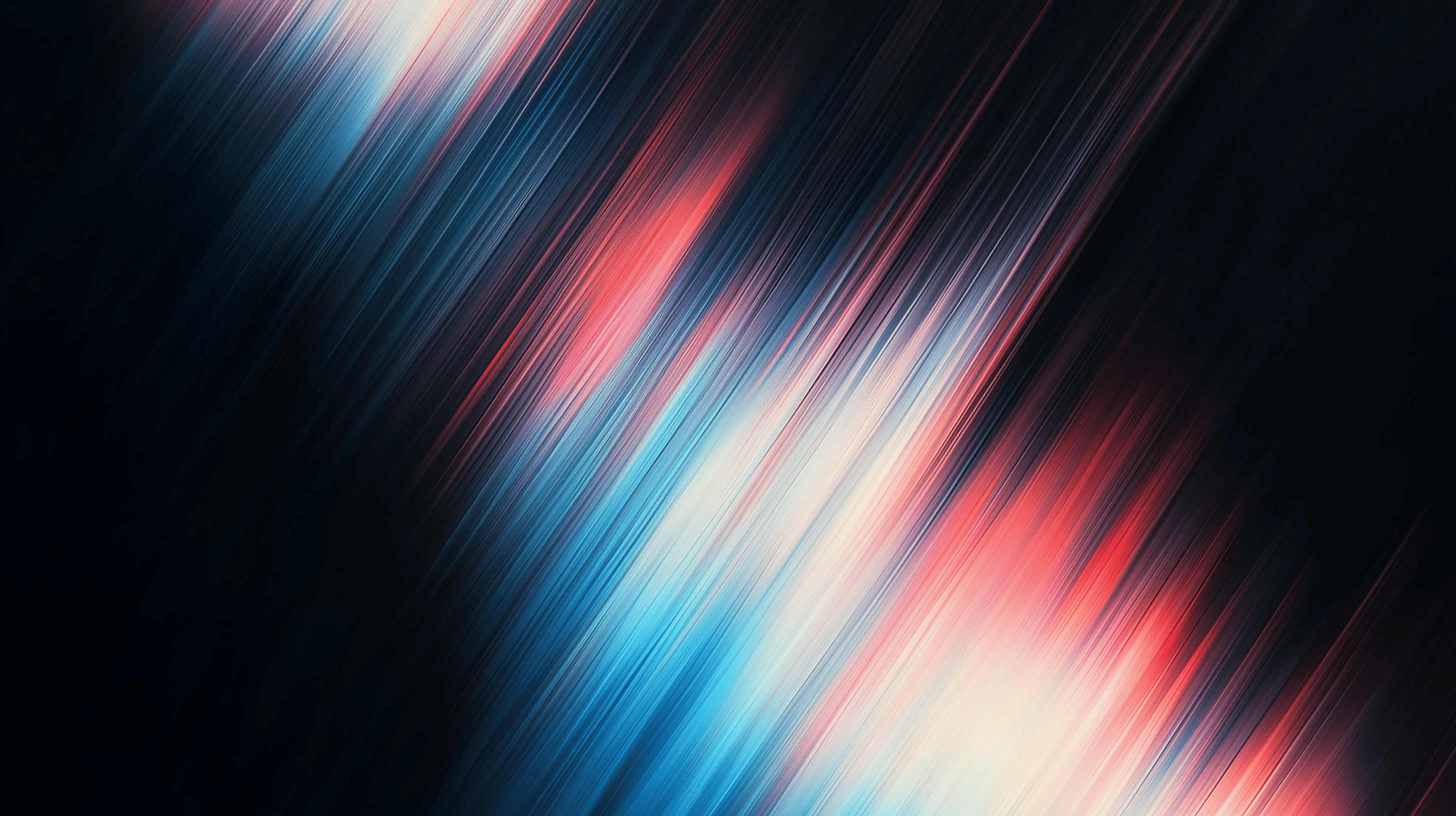
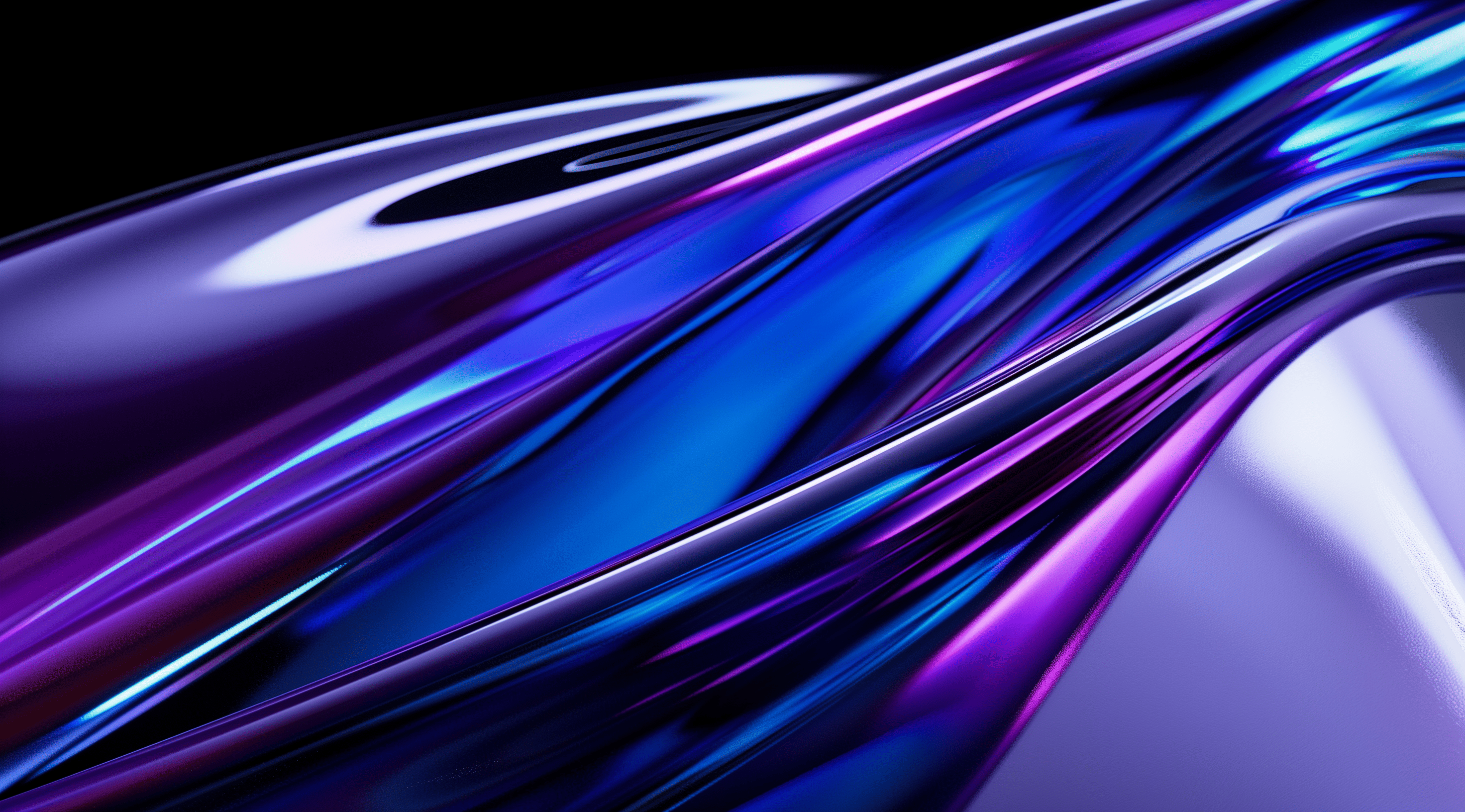
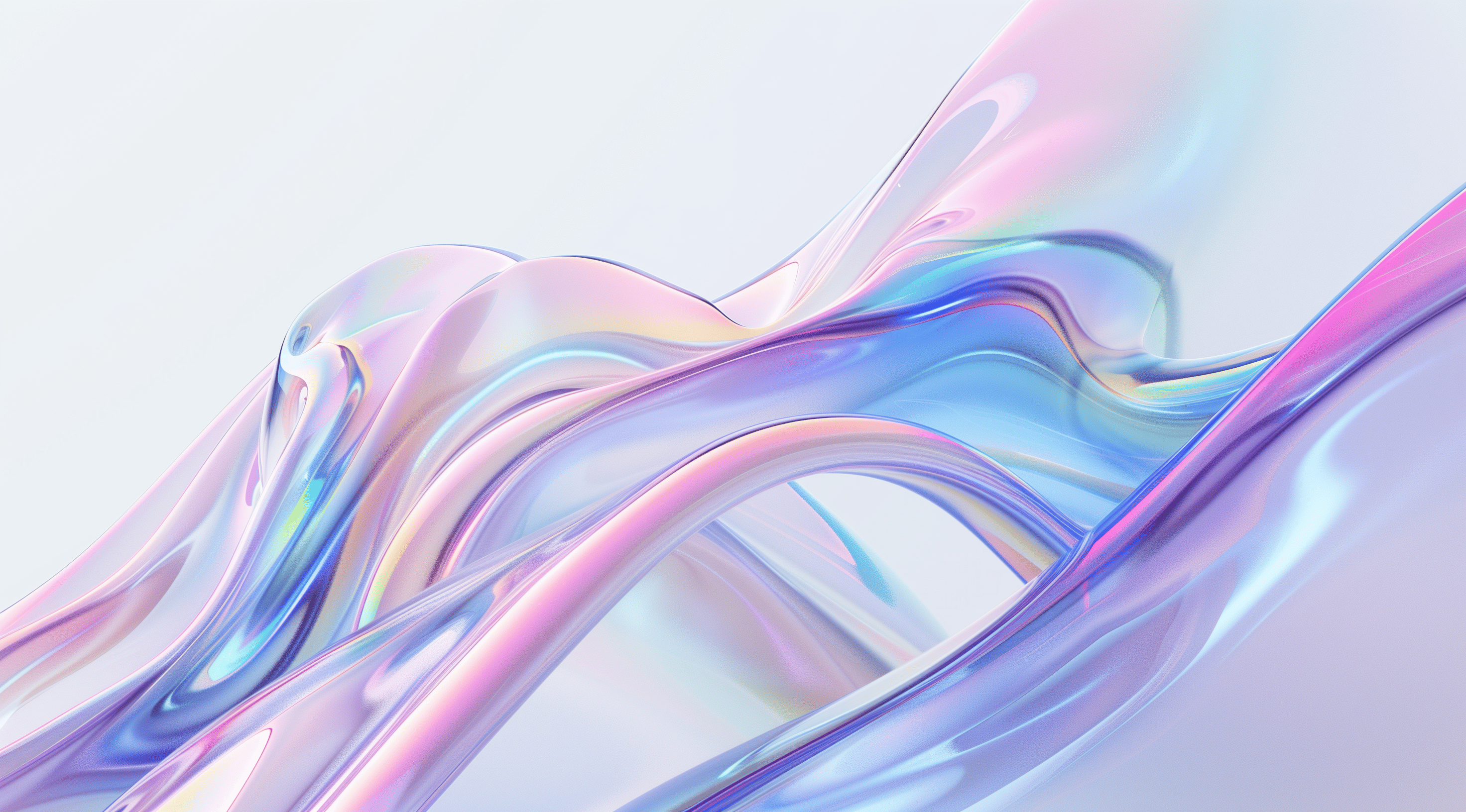
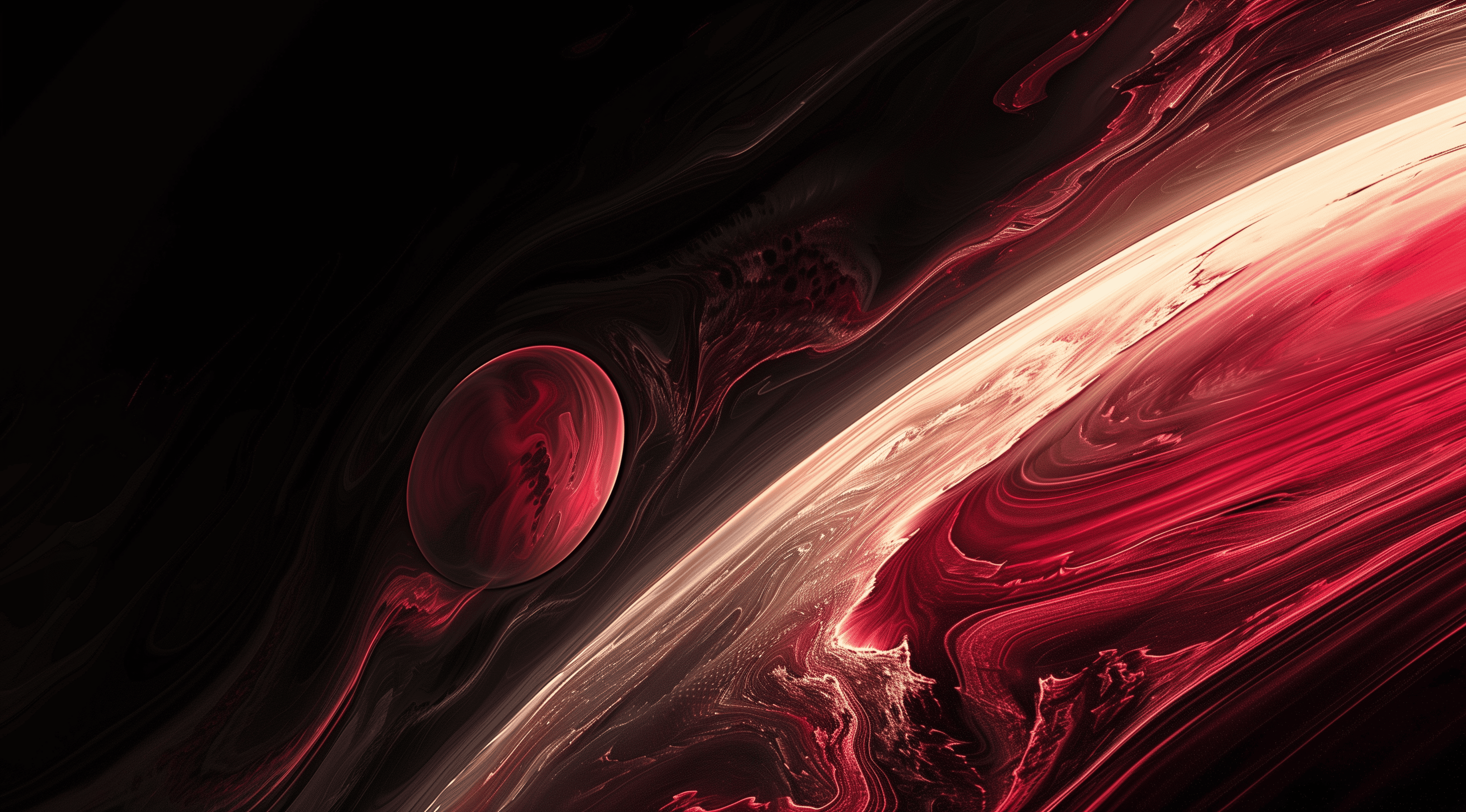
- Linear: colour travels in a straight line at an angle. The default for hero sections, buttons, and slide backdrops. Change the angle to change the mood: a near-vertical fade feels calm, a diagonal feels energetic.
- Radial: colour radiates from a point outward. Use it to create a soft spotlight that pulls the eye toward a headline or a product shot sitting in the centre.
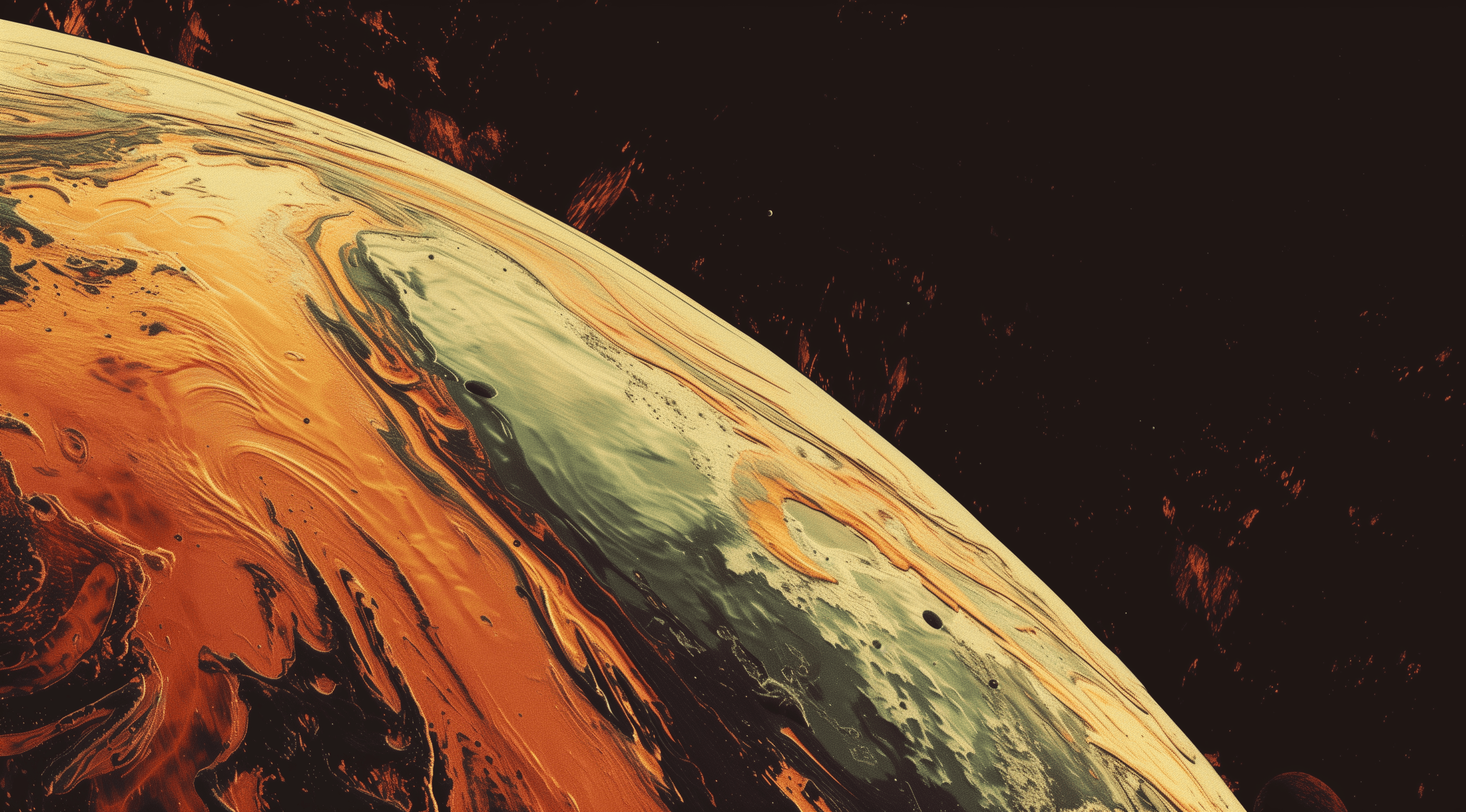
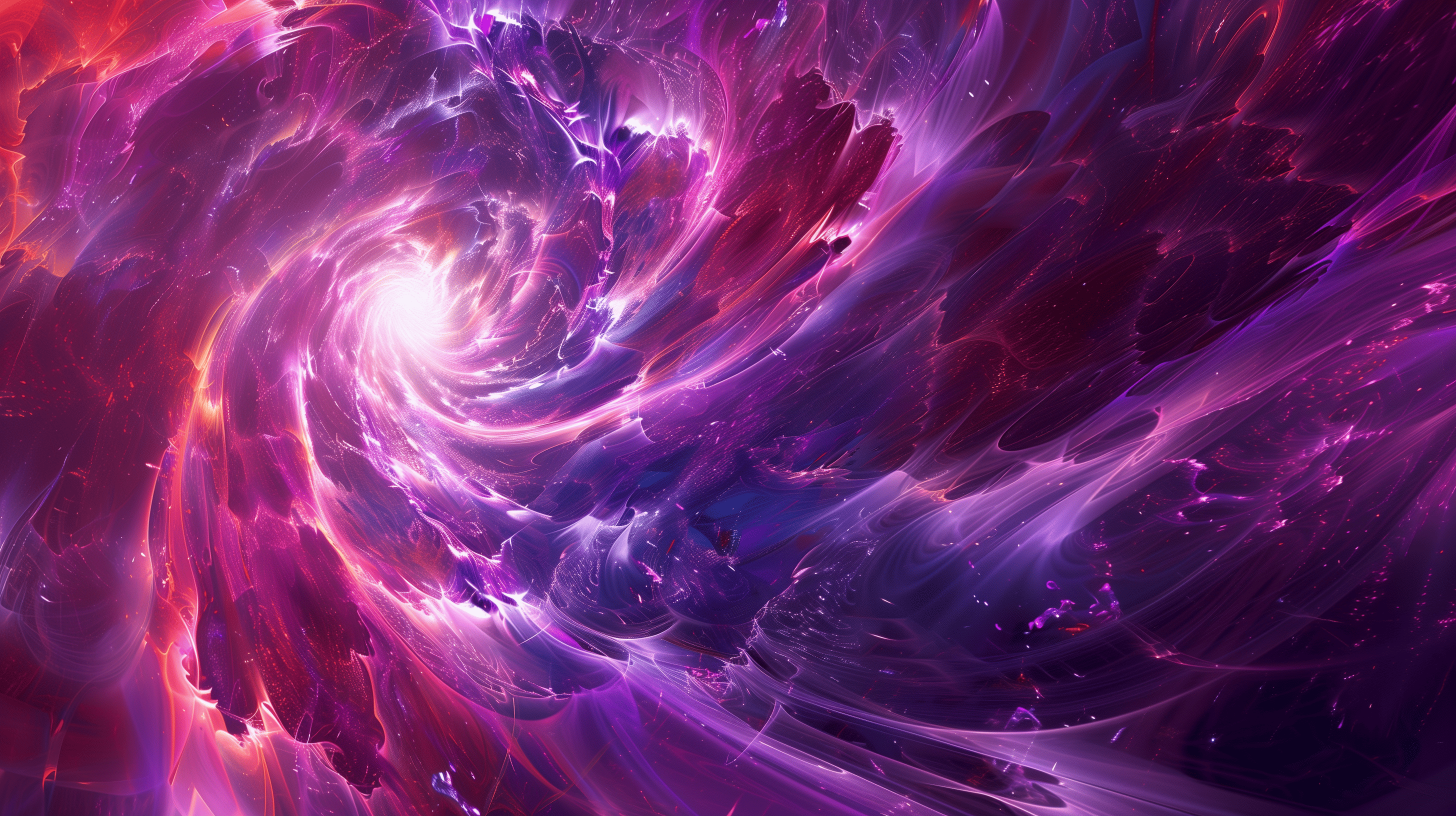
- Mesh: several colour points blended across the canvas. The richest and most organic look, and the hardest to hand-tune. This is where a curated library or a generator saves you an afternoon.
The colour rule: two, maybe three
The single most common mistake is too many colours. A clean gradient uses two hues, occasionally three, and keeps them close on the colour wheel so the transition is smooth rather than muddy. Analogous palettes (neighbours on the wheel, say a pink into a magenta) almost always read as intentional. Complementary pairs can work but need a careful midpoint or they turn grey in the middle.
If a gradient looks muddy in the middle, your two colours are too far apart on the wheel. Move them closer, or add a transitional stop.
Contrast is non-negotiable
A gradient is a background, which means something usually sits on top of it. Light text on a bright gradient, or dark text on a dark one, fails the moment it hits a low-contrast patch. Two reliable fixes: keep text over the darkest (or lightest) region of the gradient, or drop a subtle solid scrim behind the text. Always check the actual contrast ratio against the lightest point of the gradient, not the average.
Where gradients work
- UI: hero sections, empty states, card surfaces, and to draw the eye toward a primary call to action.
- Presentations: title and section-divider slides, where a gradient adds polish without competing with your words. (More on that in our guide to choosing presentation backgrounds.)
- Social: a gradient is a fast, on-brand canvas for a post or thumbnail when you don't have a photo that fits.
Getting good gradients without the fuss
You have three options: hand-build them (full control, slow), generate them, or pull from a curated set. If you like to tinker, the Gradient Lab lets you roll your own and export a PNG or a looping MP4. If you'd rather just drop one in, the Backgrounds Supply library is a few hundred handcrafted gradients ready to use, and the free pack is a no-signup way to try the quality first.
Whichever route you take, the rules are the same: two or three close colours, the right shape for the job, and enough contrast that whatever sits on top stays legible. Get those three right and a gradient does exactly what good design should: it looks effortless.